Leipziger Literaturverlag
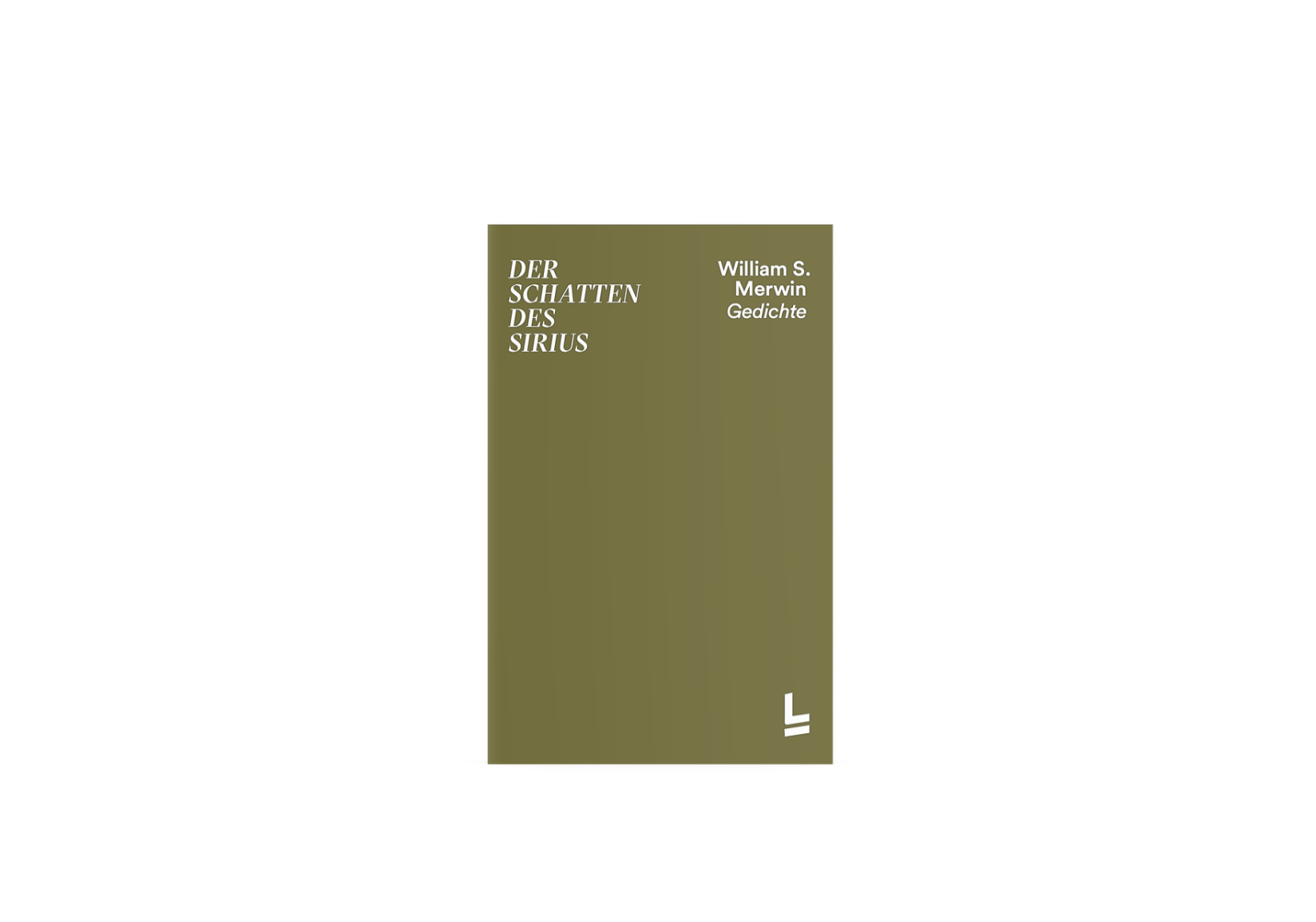
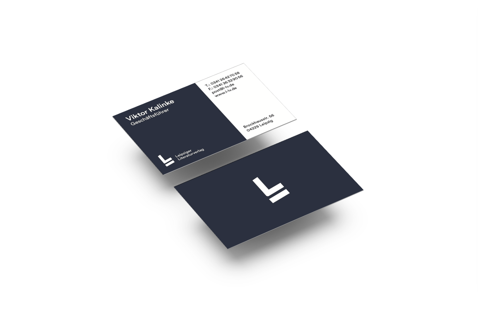
In the typography course during the second year of my studies I got the task to choose a publishing house and do a redesign of its complete visual appearance. The result for the book series was a reduced monochrome design with a distinctive typo. As an additional element that's gives a graphic accent paper band spans over the book. The minimalistic logo consists of an underlined L Letter, it can be seen as a combination of company's name beginning two letters, otherwise it comes to association with an open book.